Showing posts with label Google Updates. Show all posts

Android Introduces “Expanded Dark Mode” to Force a Dark Theme

Google Extended Dark Mode

Google is testing a powerful accessibility-focused feature in the second Android Canary build that forces Dark Mode on apps without native dark themes. Dubbed Expanded Dark Mode, it sits alongside the traditional “Standard” dark theme and brings remarkably better system-wide consistency—though not without caveats.

What’s new in Expanded Dark Mode?

Standard Dark Mode: Applies a dark theme only to Android system UI and apps that support it natively.

Expanded Dark Mode: Extends dark styling to apps that lack built-in dark themes. It works more intelligently than the previous “override force‑dark” option, avoiding blanket color inversion in favor of a more refined approach.

Because this feature is experimental and only available in Canary builds, users may encounter visual glitches in some apps—such as inconsistent colors or layout issues. Google openly cautions users that not all apps will “play nice,” and in such cases recommends switching back to Standard mode .

The rollout timeline for Beta or Stable channels is not confirmed, though speculation places it in Android 16 QPR2 (expected December 2025).

How to Enable Expanded Dark Mode (In Android Canary builds)

If you’re using an Android device enrolled in the Canary channel, here’s how to turn it on:

Step 1. Open Settings.

Step 2. Navigate to Display & touch → Dark theme.

Step 3. You’ll now see two modes:

  • Standard
  • Expanded
Google Extended Dark Mode
Credit: Android Authority 

Step 4. Select Expanded to enforce dark styling across more apps—even ones without native support.

Step 5. If you notice any display or layout glitches in specific apps, toggle back to Standard mode.

This feature replaces the older hidden “make more apps dark” or “override force‑dark” settings found in Developer Options, offering a cleaner, user-facing placement in the display settings.

How This Update Will Be Useful?

Users who read or browse their phone in low-light environments—such as at night—will find a more consistent, eye-friendly experience even with apps that haven’t been optimized for dark mode.

While Developer Options offered “override force-dark,” Expanded Dark Mode appears to use more intelligent logic to convert UI elements without distorting images or causing widespread visual distortion.

This feature is part of an unstable release. You should expect bugs. Android will let you revert to Standard mode if that improves app stability or appearance .

When it arrives in Beta or Stable under Android 16 QPR2 or later, it could become a key feature for dark‑mode enthusiasts.

Google Keep Receives Fresh, Colorful Update with Material 3 Expressive Design.

Google Material 3 Design
Key Takeaway.
  • Google Keep now features a thicker search bar, animated logo text, and visual layout toggles for improved navigation.
  • Action buttons within notes are repositioned into distinct rounded containers for a cleaner, more accessible editing experience.

Google Keep on Android has begun getting a visual refresh thanks to Google’s Material 3 Expressive design update. Users on version 5.25.282.00.90 have spotted colorful, user-friendly changes activated via a server-side update rather than a full app download.

On the home screen, Google Keep now has a thicker search bar that includes a hamburger menu button on the left and a profile switcher on the right. These updates offer clearer separation between elements. When the app launches for the first time, an animated “Google Keep” text appears, then it transitions to “Search Keep” with a layout selector for list or grid view.

Inside notes, action buttons have moved into rounded containers. The pin, reminder, and archive icons appear in square-shaped bubbles, while formatting options like color, text, and attachments are grouped into circles. The app’s overflow menu now appears as a pill-shaped button, where the “Edited” timestamp has been relocated.

This refreshed look matches what Google has done in other Material 3 Expressive updates. Earlier this year, the design was introduced in apps like Gmail, Messages, Wallet, Phone, Meet, and even parts of Wear OS. Google Keep’s update seems to be rolling out slowly—some users have it now, while others will get it soon.

Google Photos Rolls Out AI Tools to Animate Images and Add Artistic Effects.

Google Photos Logo on Android Phone
Key Takeaway.
  • Google Photos now lets users turn still images into short animated videos using AI-powered motion effects.
  • The new Remix feature transforms photos into artistic styles like anime, sketch, and 3D, offering more creative freedom.

Google Photos is taking another step forward in creative photo editing by launching two innovative features: photo-to-video conversion and Remix. These tools are powered by Google's Veo 2 generative AI model and are being rolled out gradually for users in the United States on both Android and iOS devices. With this update, Google aims to give users more ways to creatively reimagine their memories using intuitive and powerful technology.

Bring Photos to Life with the Photo-to-Video Tool.

The new photo-to-video feature allows users to turn still images into short, animated video clips. You can choose between two effects, called “Subtle movements” and “I’m feeling lucky.” These effects gently animate parts of the photo, such as moving water, shifting clouds, or fluttering leaves. The final video clip lasts about six seconds, and the rendering may take up to one minute. 

Users are given several variations to preview, so they can choose the one that suits their vision best. This feature is completely free and does not require access to Gemini or any paid plan.

Transform Images with the Artistic Remix Feature.

In addition to video animations, Google Photos is launching the Remix tool, which lets users apply artistic filters to their photos. These include styles like anime, sketch, comic, 3D animation, and more. The Remix feature is designed to be fun, expressive, and highly customizable. It will begin rolling out to users in the United States over the next few weeks, and it is intended to be simple enough for anyone to use, regardless of experience with photo editing.

To make these new tools easier to access, Google Photos will soon introduce a new Create tab. This tab will be located in the bottom navigation bar of the app and will organize creative tools such as photo-to-video, Remix, collages, and highlight reels in one convenient place. The Create tab is expected to be available starting in August.

Google Watermark on AI-Generated Content.

Google has stated that all content generated through these AI features will include a SynthID digital watermark. This watermark is invisible to the eye but helps verify that the media was created using AI. In addition to this, video clips created through the photo-to-video tool will display a visible watermark in one corner of the screen. Google is encouraging users to rate AI-generated content with a thumbs-up or thumbs-down to provide feedback and help improve the tools over time.

The photo-to-video animation feature became available to U.S. users on July 23, 2025. The Remix feature will become available in the coming weeks. The new Create tab is scheduled to roll out sometime in August. These features will be added automatically, but they may appear at different times for different users depending on regional availability and server updates.

Google Confirms Media Controls Bug in Google Maps: Fix on the Way

Google Maps Logo on a Phone

Google Maps on Android recently experienced an unexpected glitch that removed the integrated media playback controls for music apps like YouTube Music and Spotify. Users on version 25.28 (stable) and 25.29 (beta) noticed the absence of album art, play/pause, skip buttons, and the “Show media playback controls” toggle under Settings → Navigation—a feature that remains fully functional on iOS devices.

Key Takeaway.
  • Google Maps’ built-in media controls for Android were unexpectedly removed in recent updates, and users can’t access playback without switching apps.
  • Google has confirmed the issue is a bug and said it is actively working on restoring the media controls in an upcoming update.
Google Maps Media Playback Settings
Media Playback Control in Google  Maps

These media controls once appeared as a convenient bottom bar during navigation. They displayed album art, song titles, artist information, and offered quick access to the default media app. Drivers could skip tracks, pause, or tap “Browse” to get nine song suggestions and all without leaving the navigation screen.

While some users suspected Google removed the feature intentionally during the transition away from Assistant Driving Mode, the company clarified that the disappearance was due to a bug. A spokesperson confirmed that Google is “actively working to fix an issue that is affecting media playback controls on Google Maps,” although an exact timeline for the fix has not been shared.

For now, Android users must rely on alternative methods for media control, such as notifications or launching their music app directly. Some are even exploring navigation alternatives like Waze, which still supports in-app media controls. Meanwhile, Google reassures users that the feature is not going away permanently but will return in a future update.

Google Drive Adds Video Thumbnail Previews to Progress Bar.

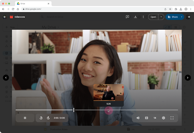
Google Drive Add Thumbnail Preview in Video
Credit: Google

Key Takeaway.
  • Google Drive now shows thumbnail previews when hovering over the video progress bar, making navigation easier and faster.
  • The feature is rolling out from July 22, 2025, and applies only to newly uploaded videos across all Google account types.

Google Drive has introduced a long-requested feature that significantly improves video playback on the web: thumbnail previews along the video progress bar. This enhancement brings Drive closer to platforms like YouTube in terms of user experience and makes navigating through videos faster, smarter, and more precise. The update was officially announced via the Google Workspace Updates blog and is now rolling out to both personal and Workspace accounts.

Google Drive Feature for Better Video Browsing.

Until now, scrubbing through videos in Google Drive was mostly guesswork. Users had to drag the playhead blindly along the timeline and hope to land on the right scene, especially frustrating when watching long lectures, recorded meetings, or training videos. With this update, hovering over the playback bar now reveals live thumbnail previews for different scenes, allowing users to scan the video visually and jump directly to the moment they want.

The new feature behaves much like YouTube’s progress bar preview, making video navigation intuitive and reducing the time spent searching through footage. It’s especially useful for educators, students, remote workers, and content reviewers who often handle large video files in Drive.

Availability and Rollout Timeline.

The thumbnail preview feature is part of a gradual rollout that began on July 22, 2025, for users on Rapid Release domains. It will begin reaching Scheduled Release domains starting August 20, 2025. Google confirms that the feature will be available to all users, including:

  • Personal Google Accounts
  • Google Workspace Business and Enterprise plans
  • Google Workspace for Education, Nonprofits, and Essentials

However, there is one important limitation: the thumbnail preview only works with videos uploaded after this update. Existing videos stored in Drive prior to this rollout won’t show thumbnails when scrubbed. Google has not confirmed whether this capability will be extended to older videos in the future.

Why This Google Drive Update Matters.

This may seem like a small interface tweak, but it has big implications for productivity and user experience. Whether you're watching training content, searching for a quote in a recorded webinar, or reviewing a long-form client presentation, the ability to visually scan through a video without guesswork is a major time-saver.

More broadly, it reflects Google's intention to evolve Drive from a simple storage service into a more interactive workspace, especially as demand grows for media-friendly cloud platforms that support remote work, education, and collaboration.

With this update, Google continues enhancing the usability of its core productivity tools. By making video navigation more visual and intuitive, Drive becomes even more valuable for users who regularly manage or review video content. It’s a step toward turning Google Drive into a smarter, more responsive workspace that supports a variety of content formats, not just documents and spreadsheets, but rich multimedia, too.

Google Chrome for iOS Adds Work & Personal Profile Switching.

Google Chrome for iOS Add Work and Personal Profile
Credit: Google

Google is rolling out a new feature in the Chrome browser on iOS that enables users with enterprise accounts to seamlessly switch between personal and work profiles. This feature, part of Chrome Enterprise, helps maintain privacy and productivity by keeping browsing data—such as history, tabs, and passwords segregated between profiles.

When employees sign into a managed Google account in Chrome on iOS, they will see a prompt with an onboarding screen that explains how personal and work data will stay separate. Once set up, switching profiles is as easy as tapping the profile icon in the upper right corner and selecting the desired account, ensuring a smooth transition between personal and work browsing within the same app.

IT administrators gain enhanced control through this update, leveraging extended enterprise protections such as URL filtering, site restrictions, and access to security reports via the Google Admin console. This feature supports both BYOD (bring-your-own-device) policies and corporate-issued scenarios, aiming to offer security without sacrificing convenience.

How to Use Profile Switching in Chrome for iOS

Step 1. Sign in with a work account
  • Open Chrome on your iPhone or iPad and sign in with your work Google account when prompted.
Step 2. Complete onboarding
  • You will see a screen explaining data separation (tabs, history, cookies, etc.) between work and personal profiles—tap through to confirm.
Step 3. Switch profiles
  • Tap your profile picture in the top-right corner of Chrome.
  • Choose between your personal account and the managed work profile.
Step 4. Experience data separation
  • The work profile will have its own tabs, saved passwords, browsing history, and security settings (e.g., restricted access to certain sites).
  • Personal browsing remains unaffected—each profile is isolated.
Google Chrome Update for iOS

This update addresses a growing need in enterprise environments as more employees access work resources from personal devices. By embedding secure, on-device profile switching, Google ensures a seamless balance between data privacy and usability, providing administrators with better oversight while maintaining user convenience.

While Android users rely on system-level work profiles, this iOS-specific solution offers equivalent functionality directly within Chrome, making it easier for enterprise users to manage their browsing without juggling multiple apps or signing in and out repeatedly.

Google Maps Testing UI Revamp for Place Listing Pages on Android.

Google Map Open on a Phone
Key Takeaway.
  • Google Maps is testing a refreshed UI for place listings, featuring a cleaner Material 3 card layout and improved readability.
  • Key changes include moving “Popular Times” above reviews and turning core actions like “Suggest an edit” into prominent buttons.

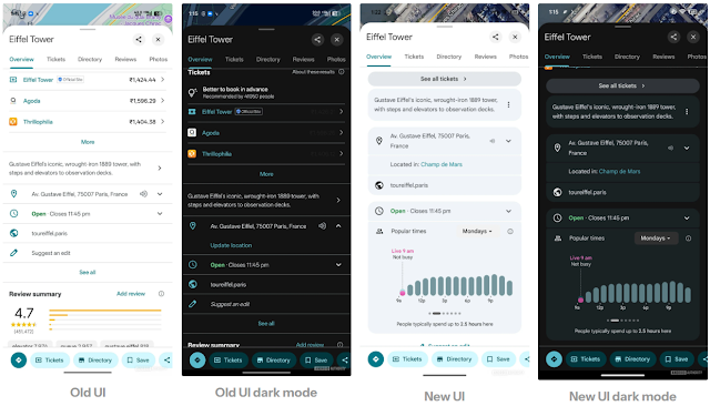
Google Maps is receiving a subtle but impactful redesign of its place listing pages on Android, using an updated look to improve clarity and usability. These changes are currently spotted in version 25.29.00.782600971 via an APK teardown from Android Authority.

First and foremost, the overall visual design moves to a cleaner, Material 3-style card interface, replacing the earlier line-separated layout. This refresh enhances readability and aligns Maps with Google's evolving design language.

Another notable update involves the reordering of the “Popular times” section, which previously appeared below user reviews but now sits above them. This means users can more quickly assess peak visitation data before diving into reviews.

Credit: Android Authority

Google has also improved the layout for interactive tools: Suggest an edit, measure distance, add a missing place, and add your business. These are now fully furnished buttons rather than tucked-away options. These buttons are more prominent, particularly when viewing information about broader areas like cities or countries.

Why This Update Matters

This more refined interface ensures that essential details like visitation peaks and useful actions are immediately visible, making the app faster and more intuitive. Whether you're planning a trip, exploring a new city, or checking business hours, the updated placement and clarity of these elements make key information quicker to access while keeping the map context front and center.

What’s Next?

As this redesign is currently in the early testing phase, users may see the changes roll out gradually through upcoming updates. If the new design gains positive feedback, it could become the standard interface for Google Maps place listings on Android devices worldwide.

Everything New in Android 16 QPR1 Beta 3.

Android 16 Logo

Android 16 QPR1 Beta 3 (build BP31.250610.004) has landed, and it's shaping up to be the final polishing step before the stable release expected in September. If you're enrolled in the QPR1 beta on compatible Pixel devices, you’re getting a refined experience with essential bug fixes, minor UI upgrades, and two standout features designed for accessibility and productivity. Let’s explore what's new.

Android's Quarterly Platform Releases (QPR) deliver regular, bug-focused improvements to the OS without introducing major new APIs ideal for stability and polish. Beta 3 marks the last preview of QPR1, heavily focused on enhancing reliability before the stable rollout.

Key Features & UI Enhancements.

Keyboard Magnifier in Accessibility

One of the most meaningful additions in Android 16 QPR1 Beta 3 is the Keyboard Magnifier, specifically designed for users with low vision. Found under Settings → Accessibility → Magnification, this new toggle allows users to magnify just the keyboard when it's active, without zooming the entire screen.

This seemingly small change has huge implications for accessibility. Previously, magnifying a screen meant zooming in on all UI elements, which could be disorienting and slow. With the Keyboard Magnifier, the rest of the screen remains static while just the keyboard is enlarged, letting users comfortably type messages, search queries, or login credentials with less visual strain.


Desktop Mode Shortcut Enhancements.

For users experimenting with Android’s Desktop Mode, especially on larger screens like tablets or via external monitors, QPR1 Beta 3 introduces an intuitive feature: the ability to pin and unpin apps directly from the taskbar.

Previously, users had limited control over the taskbar’s appearance in desktop mode. Now, by long-pressing any app icon, a new context menu appears with options to "Pin to Taskbar" or "Unpin." This gives users a Windows-like customization ability, enabling a more streamlined, personalized workspace when using Android as a desktop OS alternative.

Whether you're multitasking between Gmail, Google Docs, and YouTube, or turning your Pixel Tablet into a workstation, this update helps build toward a smoother, more PC-like experience on Android. It also signals that Google is investing more in productive and flexible UX across screen sizes.

5-Bar Cellular Signal UI.

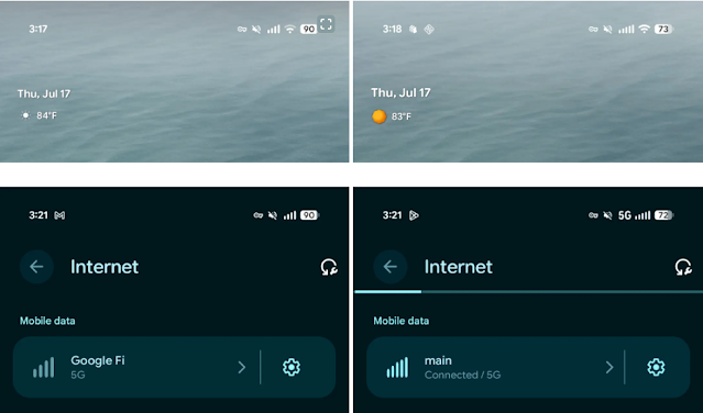
Another quiet—but-effective change in Beta 3 is the update to Android’s cellular signal bar UI, which now consistently displays five signal bars instead of the previous four. This brings Android’s design closer to iOS and offers users a more nuanced view of their signal strength.

Why does this matter? For many users, especially those in rural or congested urban areas, knowing the difference between “barely connected” and “strong signal” can affect how and when they make calls, use data, or switch to Wi-Fi. More signal granularity equals better real-time decisions for users on the go.

Android 16 QPR1 Beta 3
Credit: 9to5Google

Refined Settings & System UI Details

Android 16 QPR1 Beta 3 also brings a batch of minor UI refinements to the Settings app, Quick Settings panel, and launcher widgets—subtle but impactful.

For example:
  • Spacing between settings options has been slightly adjusted for better tap targets and visual clarity.
  • Toggle switches now have a more responsive animation, creating a smoother feel during navigation.
  • The At-a-Glance widget on the home screen has been restored to include colorful weather icons, improving both the aesthetic and usability at a glance.

Nine Major Bug Fixes.

This Beta addresses nine headline issues flagged by users:

  1. RTOS task list kernel bug causing restarts

  2. Launcher display glitches

  3. Notification rendering problems

  4. Media player malfunction in shade

  5. Class loader restart bug

  6. Kernel-caused restarts

  7. Camera startup black screen fix

  8. Status bar padding adjustments

  9. Notification folding issues.

With at least nine key problems resolved, the update significantly boosts device reliability.


What's Still Missing?

Several experimental improvements remain absent from Beta 3, including:

  • Qi2 charger screen savers

  • Enhanced HDR brightness toggle

  • Dedicated "Parental controls" menu

  • New 90:10 split-screen ratio

  • Tablet bubble bar and lock‑screen blur UI.

Google appears to reserve these for future Canary or stable builds.

This release supports Pixel 6 and newer, including Pixel 6a, 7/7 Pro, 7a, Fold, 8 series, 9 series, and Pixel Tablet. If you're enrolled in QPR1 beta and want stability over bleeding-edge features, this is an optimal moment to either remain enrolled or opt out ahead of the September stable release.

Google expects to launch Android 16 QPR1 Stable on September 3, 2025. To ensure you receive it, unenroll post-Beta 3—you’ll otherwise be moved to QPR2.

YouTube Launches A/B Testing for Video Titles in Studio.

YouTube Studio Open on an iPad
Key Takeaway
  • YouTube now allows creators to A/B test video titles in Studio to optimize engagement and click-through rates.
  • The new “Test & compare” tool lets users experiment with multiple title variants, using watch time data to pick the best one.

YouTube is rolling out a thoughtful update to YouTube Studio, empowering creators with the ability to A/B test video titles separately from thumbnails. This enhancement builds on YouTube’s existing thumbnail testing and aims to boost content performance through data-driven choices.

In a recent announcement, YouTube confirmed that a subset of creators now has access to the “Test & compare” tool, which allows them to experiment with multiple title variants for a single video. The platform will present these versions to different audience segments, tracking metrics like watch time to identify the most compelling title before fully committing to one.

This update is significant because more engaging titles can substantially increase click-through rates (CTR) and overall viewer retention. Social Media Today highlights that creators, particularly top-tier channels with dedicated teams, spend hours crafting and refining both titles and thumbnails. YouTube’s built-in testing mechanism means creators can now validate their instincts with actionable data.

Historically, YouTube released its thumbnail A/B testing feature in 2023 and later expanded it to more creators in 2024. With this title testing rollout, creators gain a more holistic optimization suite to maximize their videos’ reach and growth.

As A/B title testing becomes more widely available, YouTube promises to integrate analytics directly into Studio, giving creators real-time insights into which titles resonate best. The company aims to refine the feature further before a broader launch for all users.

Google Phone App on Wear OS Gains M3 Expressive.

Pixel Watch 3
Key Takeaway
  • Google's Phone app for Wear OS gets a sleek Material 3 Expressive redesign, enhancing usability and visual clarity.
  • The update introduces a revamped in-call screen, easier navigation, and consistent UI with Android 16 and Wear OS 6.

In a notable move toward unifying design across its platforms, Google has begun rolling out a striking redesign of its Phone app for Wear OS smartwatches. This update introduces the Material 3 (M3) Expressive design language, giving the app a cleaner, more intuitive, and visually consistent interface that aligns with Android 16 and Wear OS 6.

The redesign, first spotted by users and detailed by 9to5Google, marks a significant upgrade to the in-call experience and general usability of the app. It’s part of Google’s broader mission to bring Material 3 Expressive aesthetics and functionality to all its core apps across devices, including smartphones, tablets, foldables, and now wearables.

A More Intuitive In-Call Experience.

The most noticeable improvements come to the in-call screen, where UI elements have been repositioned for clarity and ease of use. The iconic red “End Call” button, previously placed among other controls, has now been moved to a prominent location at the bottom of the screen, making it easier to tap quickly and confidently, especially on smaller smartwatch displays.

Expressive UI showing up on pixel watch phone app after Beta 3
byu/sesteele13 inPixelWatch

Other controls, such as mute and the “more options” button, have also been moved upward, improving overall layout symmetry. In addition, the call duration timer is now centered horizontally on the display, offering a more balanced and visually appealing interface.

These changes may appear subtle at first glance, but they significantly enhance usability. They address one of the biggest pain points of wearable tech: the challenge of precise interactions on small screens.

Dialer Improvements and Navigation Enhancements.

Beyond the in-call interface, the update modernizes other key parts of the app. The dialer screen now features updated button styling and improved spacing, allowing for easier tapping and reducing the likelihood of accidental inputs. The new design is not only more functional but also fits naturally within the broader aesthetic of Android 16.

Google has also updated the “More” menu, transitioning from a grid-based layout to a cleaner, scrollable list format, which mirrors the approach used in other Material 3-based apps. This provides a more consistent and familiar experience across platforms.

Interestingly, incoming call screens now support both swipe gestures and button-based controls for accepting or rejecting calls. This dual-method approach gives users more control over how they interact with their devices, whether they're on the move or wearing gloves.

Material 3 Expressive: Unifying Design Across Devices

The updated Phone app is among several apps on Wear OS now embracing Material 3 Expressive, Google's latest evolution of its design system. Unlike the earlier Material You theme, which emphasized dynamic colors and personalization, M3 Expressive brings bolder visual elements, improved legibility, and smarter use of space, especially tailored for smaller, wearable screens.

Google has already started deploying this new design language across apps like Google Maps, Keep, and the revamped Tile system in Wear OS 6. These efforts are not just cosmetic. They aim to make Wear OS devices more consistent, accessible, and user-friendly—whether you're making a call, checking directions, or setting reminders.

What This Means for Users.

This refresh is rolling out gradually to users on the latest Wear OS builds, particularly those testing Wear OS 6 or using Pixel Watch and Samsung Galaxy Watch series. Users can expect a smoother, more modern interface that matches the visual tone of their smartphones and other Android devices.

As Google continues to invest in its wearable ecosystem—with Wear OS 6 on the horizon and Gemini AI integrations gaining momentum—the overhaul of core apps like Google Phone signals a deeper commitment to making smartwatches truly independent and intuitive companions.

For users, this means one thing: more power, more polish, and less friction in everyday smartwatch use.

DON'T MISS

Nature, Health, Fitness
© all rights reserved
made with by templateszoo